Wayfinding is one of the oldest problems in built environments, and digital screens have not made it simpler — they have made it more capable and, in the wrong hands, more complicated. A well-deployed wayfinding system reduces friction for visitors, staff, and anyone who does not already know where they are going. A poorly deployed one becomes furniture: present, expensive, and ignored. The difference is almost never about the display hardware. It is about decisions made before the screens are ordered.
The foundational question is what the system needs to communicate and to whom. A directory in a multi-tenant office building serves a different population than a wayfinding network in a hospital campus or a convention center. Office visitors typically arrive with a destination in mind — they want confirmation and routing, not exploration. Hospital patients and their families are often stressed, unfamiliar with medical environments, and moving between buildings or floors. Convention center attendees are navigating dynamic information that changes by the hour. Each scenario requires a different information architecture, and the hardware selection and placement follow from that architecture, not the other way around.
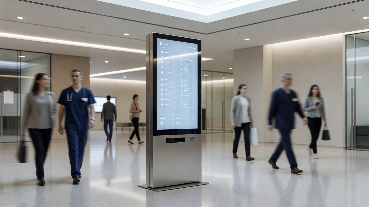
Placement is where many wayfinding deployments make their first serious error. Screens positioned at decision points work. Screens positioned where they are convenient to install — near power and data, in a corner that happened to have wall space — often do not. A decision point is the physical location where a person must choose a direction: a lobby entry, an elevator bank, a corridor junction, a stairwell landing. These are the moments where the information is needed, and screens that are not at these moments serve a different function than wayfinding, regardless of what they display.
Height and orientation affect usability more than most specifications acknowledge. A screen mounted at standard commercial height reads well for standing adults. In environments where wheelchair users, children, or people with mobility aids are a significant part of the audience, that mounting height may place critical information outside comfortable sightlines. In high-traffic corridors, a portrait-orientation screen that presents information in a vertical column may be easier to scan while walking than a landscape format that requires slowing down to read across. These are not accessibility afterthoughts — they are core usability decisions.
Touchscreen wayfinding introduces interaction design as a variable alongside display hardware. A touch directory is only as good as its interface. Menus that require multiple taps to reach common destinations will be abandoned in favor of asking a human. Search functions that do not account for common misspellings or partial name entries frustrate users at exactly the moment they are already uncertain. Printed backup directories near high-stakes touch displays are not a sign of failure — they are responsible design. Touch surfaces in high-traffic public environments also accumulate contamination quickly and require a cleaning and maintenance protocol that is factored into the operational plan from the beginning.
Non-touch wayfinding — screens that display information passively without user interaction — has its own design requirements. The information hierarchy has to be correct at the screen level because there is no interaction layer to help users drill down. Font sizes, contrast ratios, and dwell time for rotating content all matter more when the user cannot control the display. A rotating directory that cycles through forty tenants in a lobby may technically display all the information, but if the average dwell time in front of the screen is twelve seconds, most of that content is invisible in practice. Reducing content to what is genuinely useful, rather than comprehensive, is a discipline that most directory deployments resist and most users need.
Content management for wayfinding systems is an operational commitment, not a one-time configuration. Tenants move, departments relocate, event spaces change function, construction redirects pedestrian flow. A directory that goes stale within months of deployment creates active harm — it sends people in the wrong direction with apparent authority. The content management system for any wayfinding installation should be evaluated for how easy it is for non-technical staff to update, not just for how capable it is technically. The best system for a given deployment is the one that will actually be kept current by the people responsible for it.
Integration with physical signage remains important even in fully digital wayfinding deployments. Screens go offline. Power fails. Networks drop. A wayfinding system designed with the assumption that the screens will always be operational creates a dependency that fails at the worst moments — when a building is under stress from a fire drill, a power event, or a network outage. Physical directional signage at critical points provides the fallback layer, and a good wayfinding design treats digital and physical as complementary rather than as competitors for the same budget line.
Analytics from interactive wayfinding systems — search queries, most-visited destinations, paths navigated — are an underused resource for building operations. Patterns in search failures reveal naming conventions that do not match how visitors think about spaces. Overrepresented destinations reveal where more physical signage or additional screen coverage would reduce load on the digital system. Treating the wayfinding system as a source of operational insight, not just a service delivery tool, returns value beyond the initial deployment investment.
Screen-based directories are one implementation of a much older discipline — wayfinding as a design practice predates digital hardware entirely, and the Wikipedia overview covers the cognitive and environmental principles that still govern how people orient themselves in a space.