Field video: rAVe [PUBS]
Accessibility in digital screen installations is not a compliance checkbox appended at the end of a project. The decisions that most affect whether a screen is usable by people with visual, hearing, mobility, or cognitive differences are made early — in content design, mounting height, enclosure placement, and audio configuration. Retrofitting accessibility after installation is expensive when it is possible at all, and often it is not.
The starting point for most screen accessibility discussions is contrast. Text and graphic elements on a screen need sufficient contrast against their backgrounds to be readable by people with low vision, contrast sensitivity loss, or in environments where glare degrades perceived contrast. The qualitative principle is straightforward: light text on a dark background or dark text on a light background, with enough luminance difference between the two that the content reads clearly at a distance, under ambient light, and without the viewer being able to control their viewing angle or distance. In practice, content designers working outside of strict accessibility guidelines frequently drift toward lower-contrast combinations — grey text on white, pale yellow on light backgrounds — because those combinations look elegant on a calibrated monitor in a dim studio. On a lobby display with overhead fluorescent wash and a viewer at an oblique angle, the same combination becomes illegible.
Font size and typeface selection compound the contrast issue. A typeface that reads cleanly at small sizes on a desktop monitor may lose legibility at viewing distances typical for a wall-mounted display. Large x-height, open counters, and generous letter spacing all support readability at distance and for viewers with low vision. Condensed display faces chosen for visual impact tend to collapse into noise when reduced or viewed from an angle. Content governance — who approves what goes on the screen — is as important as hardware specification when it comes to long-term accessibility.
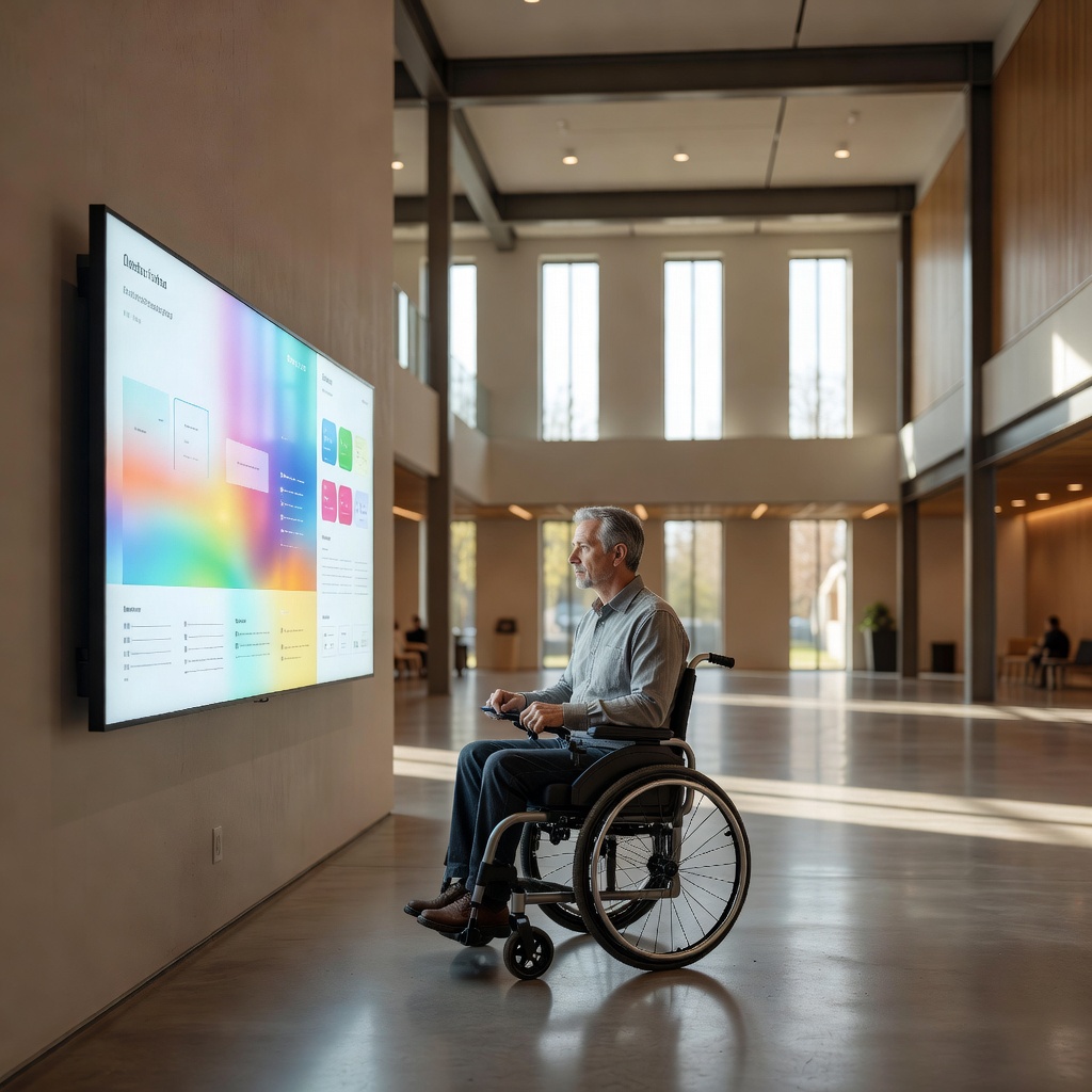
Mounting height is the most physically concrete accessibility variable. A screen mounted to optimize sightlines for standing adults will place critical content well above the comfortable viewing angle for a seated wheelchair user or a shorter adult. The general principle drawn from accessibility frameworks is that primary interactive and informational content should be reachable and readable from a seated position — which typically means the active content zone of a screen should begin lower than feels natural when you are planning the installation standing up. For touch-enabled screens, the reach envelope matters as much as the viewing angle: controls that require reaching above shoulder height are functionally inaccessible to many users regardless of whether the screen is technically reachable.
Enclosure and placement choices affect physical access in ways that are easy to overlook on a floor plan. A kiosk with a narrow base positioned in the center of a corridor creates a navigation hazard for people using canes or with low vision. Protrusions at head height from wall-mounted enclosures can be dangerous for the same population. The footprint of the installation, the clearance around it, and the approach path all factor into whether the screen is genuinely accessible rather than nominally compliant.
Audio is where many screen deployments fall short. A screen presenting video content with a spoken component in an environment where audio is not enabled — or is mixed too low to separate from ambient noise — is inaccessible to all viewers regardless of hearing status, and it excludes deaf and hard-of-hearing users entirely from audio-dependent content. Captioning addresses the audio gap for video content. For content that includes audio but no captioning option, the design choice to include audio-dependent information is itself an accessibility decision. The accessible design posture is to treat visual content as primary and audio as supplementary, not the reverse.
Where audio output is part of the installation, headphone jack or induction loop provisions extend accessibility to users who cannot access ambient audio from a speaker. Induction loops, which interface directly with hearing aids set to their telecoil mode, are a relatively low-cost addition to a fixed kiosk installation and a meaningful one for users with hearing aids. They require loop wire routed around the interaction area and a compatible amplifier, but no software change and no ongoing operational overhead once installed.
Timing and animation in content are cognitive and vestibular accessibility considerations that receive less attention than contrast and height but affect a real portion of viewers. Rapidly cycling content, heavy animation, and flashing elements can be disorienting or inaccessible to users with cognitive processing differences or vestibular sensitivities. Seizure-risk thresholds for flashing content are defined by established guidelines and represent a hard floor, not a design preference. Beyond that floor, slower content cycles, reduced motion, and clear visual hierarchy all support users who need more processing time or who are overwhelmed by dense simultaneous visual information.
Outdoor and semi-outdoor screen installations face an additional layer of accessibility challenge: glare. A screen that reads well in controlled indoor light may become effectively invisible to a user with low contrast sensitivity when the sun is high and the screen is backlit by sky. Brightness specifications for outdoor screens are typically much higher than for indoor panels precisely because ambient light competition is severe. Anti-glare surface treatments help but do not eliminate the problem. Siting a screen so that direct sun does not fall on the face of the display during peak hours is a design decision with real accessibility consequences.
The throughline across all of these considerations is that accessibility is a function of the complete system — hardware, content, placement, and context — not any single component. A high-contrast content template on a poorly placed screen helps some users and not others. Correct mounting height with low-contrast content helps different users and not others. Genuine accessibility requires the whole picture to be addressed, ideally by someone who will walk the installation with fresh eyes before it goes live.
For U.S. deployments, Section 508 accessibility requirements set the baseline for federal procurement and inform best-practice guidance more broadly — the official site covers the current standards, refresh history, and what "conformance" means in practice for interactive hardware.